App Crafters is a digital product studio that designs and builds web and mobile products - spanning HR platforms, hospitality, mobility, and delivery services.
Their site wasn't reflecting the quality of what they actually build - and for a studio that sells design and engineering credibility, that gap was the problem.
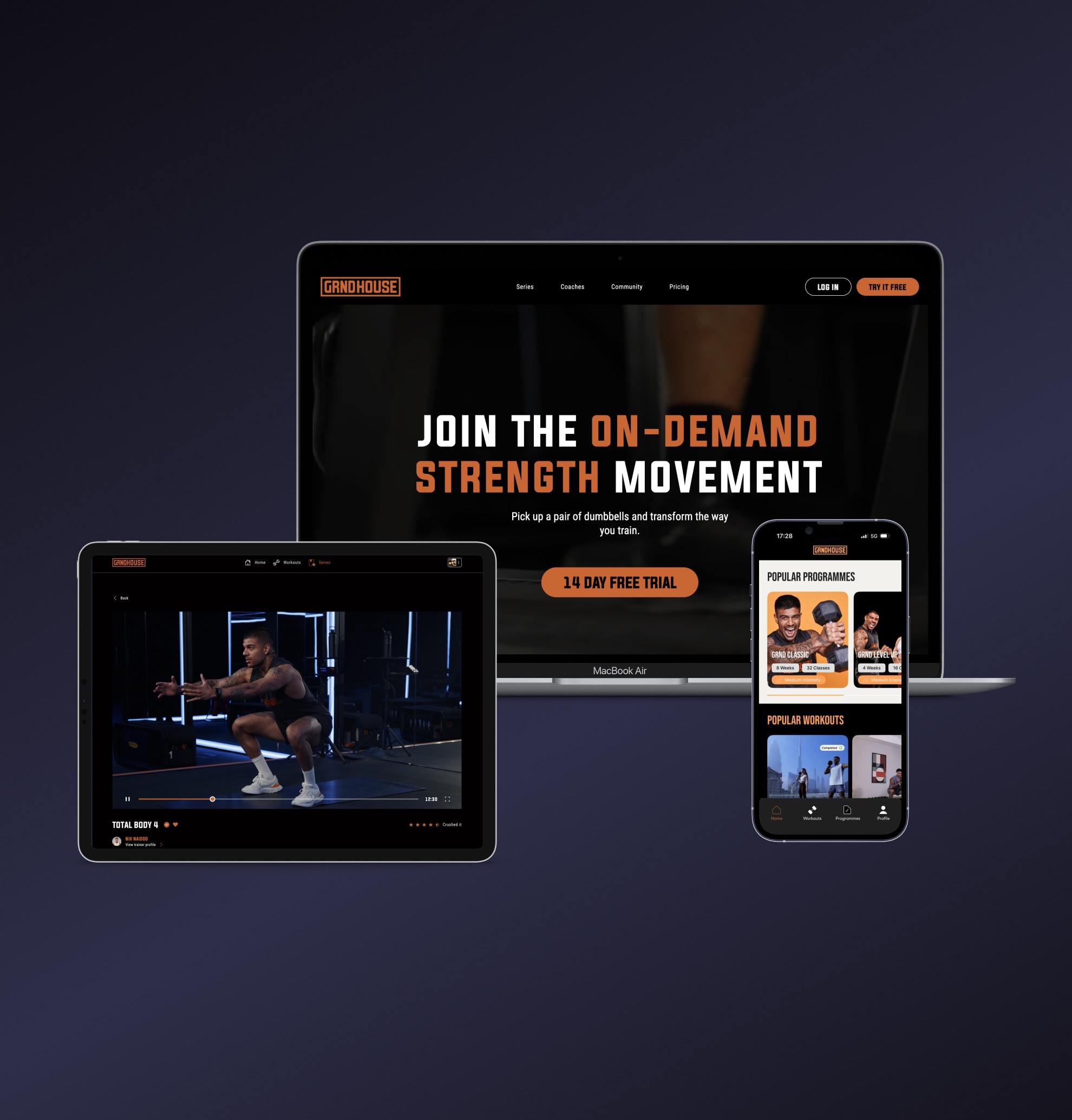
I led the full Landing Page Redesign - covering information architecture, UX and UI design, responsive layout, and visual hierarchy across all screen sizes.
Challenge
A studio that builds digital products needs a site that earns trust before a single conversation happens. The existing Landing Page wasn't doing that - projects were presented without context, the visual language was disconnected from the brand, and there was no clear hierarchy guiding visitors toward what mattered.
The redesign had one job: make the studio's work speak for itself.
Services
Landing Page Redesign
UX & UI Design
Information Architecture
Responsive Web Design
Content Structure & Visual Hierarchy
My Contribution
Led end-to-end design of the Landing Page Redesign - from auditing the existing information architecture and mapping user flows through to shipped high-fidelity UI
Restructured the content hierarchy to lead with featured projects, giving each enough context to communicate the studio's scope and quality without requiring visitors to dig
Defined a visual language across all sections - color system, typography scale, background treatment, and component behavior - rooted in the studio's existing brand but brought to a level of finish the original site never reached
Designed navigation patterns, project display layout, and scroll interactions to balance visual dynamism with clarity, avoiding effects that would distract from the work itself
Delivered fully responsive layouts across desktop, tablet, and mobile, maintaining hierarchy and readability at every breakpoint